Designing for Conversion
Good Design = Dollar Signs
Some companies believe all it takes to make a successful website is good content. While well-written, relevant content is crucial, poor design can keep visitors from moving past your homepage and ever finding out what you’re all about. It’s a simple matter of human behavior. Despite all our lifelong warnings not to, we still can’t help ourselves from judging a book by its cover.
Like it or not, website design says a lot about your company, especially to consumers who are just discovering your brand. When it comes to branding your website should be treated as the main attraction. Everything else, from print ads to web banners, are just teasers.
Your website is where potential customers go to learn more about your brand, who you are, what you do, how you work, and anything that relates to your values. This is the best opportunity to turn “looker” into “buyers”. A lot of companies bring in most their revenue from online sales alone. With that much money on the line it’s important that your website not only looks good, but is functional too.
Putting together a website that has great content and great design is a lot easier said than done. Here at Blayzer we specialize in good web design, but before we share our tips on how to optimize your web design to make sure you retain every potential dollar, we’re first going to give you examples of what NOT to do. Here’s what to avoid when designing for conversion.
Examples of Bad Web Design
Example #1

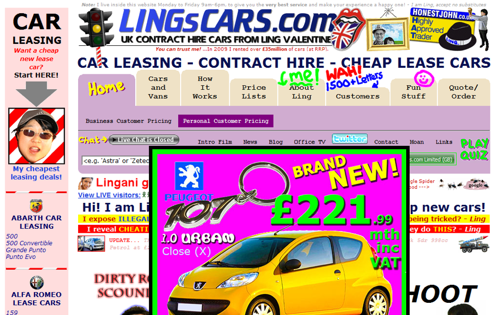
Where to begin with this one? First off, no, this isn’t a joke. There are actual websites that looks like this on the internet today. In the owners’ defense, it is usually a case of an old site that hasn’t been updated to our modern technology and design aesthetic.
The biggest design crime in sites like this one is that there is way too much going on. The site is cluttered and has no visual hierarchy. Every corner of this site is fighting for the eye’s attention. Your eyes should never have to scramble around the page to find what it’s looking for. Visual chaos scares away website visitors. You worked hard to get them onto your site, you want to keep them there. It’s a product of that old adage, “Don’t make me think!” Don’t make things harder than they need to be.
On top of the clutter issues, this design also lacks a cohesive color theme and uses too may fonts to count. Overall, this website looks chaotic and spammy.
Example #2

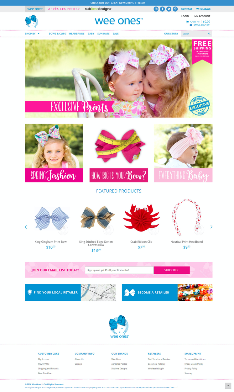
This example isn’t quite as bad as the last one, although it does have a lot of the same issues.
First off, we can’t tell what this website is all about. Who is this for? What are they supposed to do here? Your visitors should automatically be able to know what kind of product or service your company provides just by looking at the homepage.
Second, there’s again no visual hierarchy. It cannot be over-stated how important hierarchy is to good design. Hierarchy tells the eyes what to look at first, second, third, etc. It gives your design fluidity.
Third, the layout is not the most functional.
Lastly, the color scheme is dull and the overall site lacks visual interest.
Principles of Good Design
Design crimes like the examples above can definitely hurt the progress of a growing brand. Now that you know how to spot the obvious mistakes here are some tips to keep your website looking fresh. There are the must-have elements of designing for conversion.
There are six basic design principals to remember when it comes to good design:
Color
Color themes are important because they help your brand remain cohesive across all mediums and platforms. You immediately associate red and white with Coca-Cola and blue, white, and red with Pepsi. Branding should remain consistent across all marketing and communication channels in order to be successful.
Heirarchy
Hierarchy is the level of importance you assign to each element within your design. Whichever element you decide is most important is where we want the audience’s eyes to go to first when they visit your site.
Font
A font is a particular size, weight and style of a typeface. Good design should never have more than two different fonts: one for headings and one for body text. Having too many fonts becomes chaotic to the eye and difficult to read. Pick two and stick with them.
Spacing
This was a huge issue in our examples above. Spacing is the room between the elements within your design. It’s important that everything has its own space so the overall design can “breathe.” Having things too close together looks cluttered and claustrophobic. Spacing, often discussed in terms like “white space” or “negative space,” provides a slight pause in the stream of information our design and content are bombarding visitors with. This gives the brain time to not only receive, but process the information and commit it to memory. It also helps smooth the transition from one idea to the next.
Layout
Layout is the placement of each design element on the page, such as your title, subhead, body copy, call-outs, links, images, etc. Layout should be designed based on your hierarchy.
Balance
Balance is achieved when the whole design has the same amount of “visual weight.” This refers to the distribution of visual elements on the page.
Examples of Good Web Design
Design is more than just slapping text and images onto a page because you think it looks nice. It’s actually very strategic. Here are a few recent examples of good website design:


Compared to the others these are all great examples of good design principles. Every element within the design works well together as a whole. Some of these designs are simple, yet still beautiful and compelling. One of the hardest things to do in graphic design is to make simple interesting.
Quick Tips For Good Web Design
Always design with your content in mind. The website design should not compete with your content; it should enhance it.
With a busy graphic or background everything else around it needs to be toned down.
Remember what we said about hierarchy: pick your main element to bring to the forefront of the design while the supporting elements remain in the background.
Bring attention to a specific area on your website such as the call-to-action, search bar, or contact info by simply changing the font type, size, color, or placement to make it stand out.
A nicely designed website is almost guaranteed to increase web traffic, which is a good step towards increasing sales. To see some examples of how Blayzer helps our clients implement good design, check out our Results gallery.


